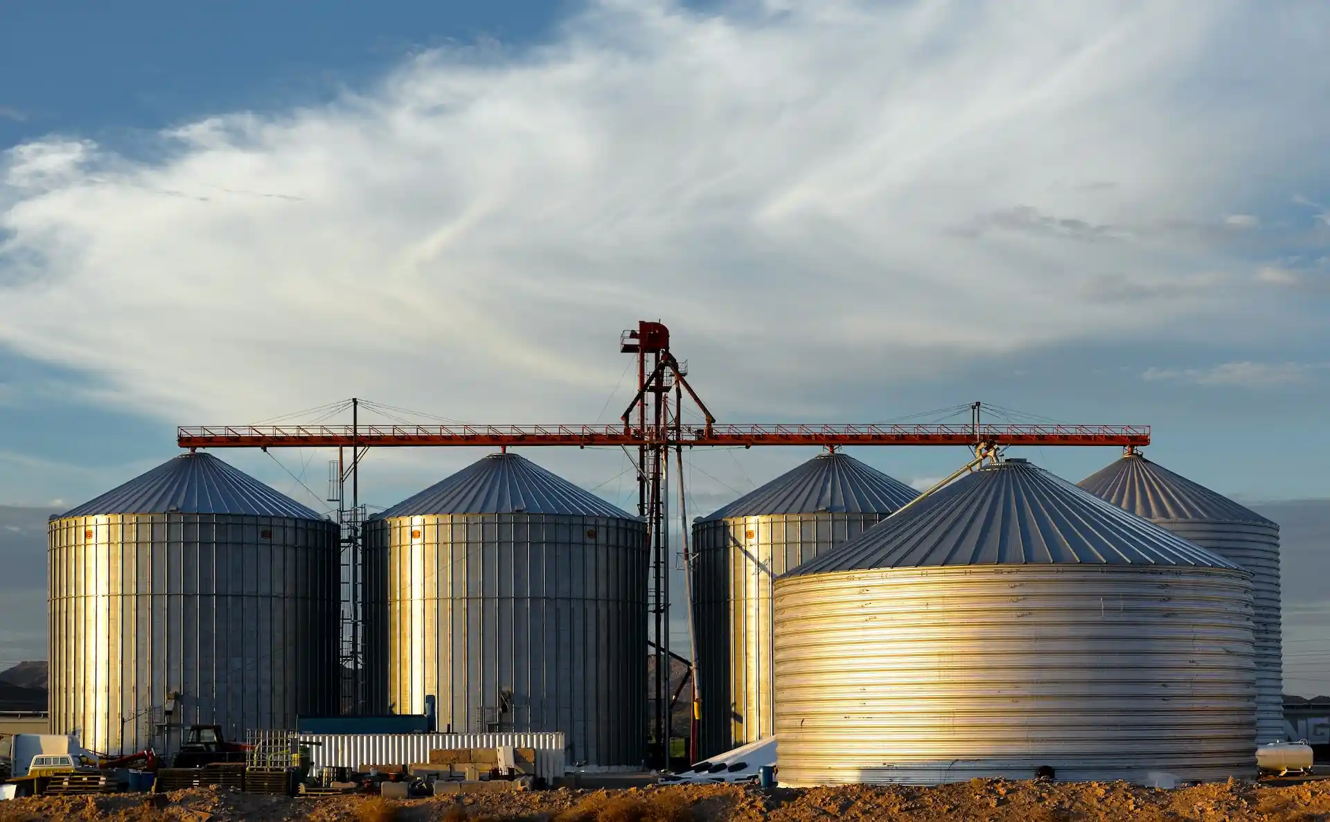
Enhancing value through research-driven product development
Market Watcher
Case Study
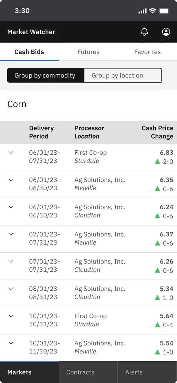
Overview
Project context
Independently completed as a part of the UX Research and Design Specialization from the University of Michigan
Highlights
I’ll explore:
- My approach to researching a complex problem space
- The impact of research on my design solution and process
For this case study, my methods include:
- User research
- Secondary research
- Personas
- UX design
The business problem
Grain farmers must sell their crops each year. But if grain prices are too low, an entire year’s work could fail to turn a profit.
To maximize revenue and reduce financial risk, farmers can use hedging strategies in the national commodities markets.
However, the markets are volatile and difficult to understand.
To persuade farmers to switch away from their current (often non-technological) workflows, I needed to design in a way compatible to their existing practices.
I couldn't offer a strong value proposition for the application until I had a thorough understanding of the market strategies farmers use to increase their revenue.
The solution
I conducted user research and relied on secondary sources to fill the gaps in my understanding. My ability to meaningfully engage with the problem space enabled me to:
Align feature sets to successful use of market strategies
Create behavior-based personas that shaped my design process
Ensure that granular details of the process were accounted for
Design contextually-appropriate features that promote deeper use of the application
My research process
Secondary sources
As a regulated and subsidized industry, there is a substantial amount of data on farming and the commodities markets from reputable online sources. By gathering as much background information as possible from secondary sources, I could focus on workflows during user interviews and avoid having to ask for information that could be found elsewhere.
My sources included:
As an entire branch of the federal government, the USDA provides a wealth of government-sponsored data on farming. A demographic census of farmers and a report on trading behaviors were crucial in informing my perspective.
Ag extension offices educate farmers in business-related manners. References like sample contracts and budgets improved the immediate practicality of my design.
As the national commodities exchange, CME Group benefits when farmers participate in the derivatives markets (futures and options), so it’s advantageous for them to provide accurate information on hedging strategies.
User research
I interviewed grain farmers, focusing on how they check the markets, their market strategies for selling grain, and their complete workflow when they decide to make a sale or place a hedge.
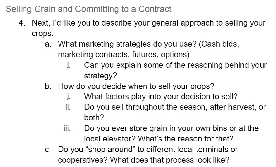
Through observations, I learned about their technical literacy, the format in which they expect to see the information, and general pain points around using technology.
Findings
How the players of the marketplace interact
As the chart below demonstrates, there is a complex interplay between several entities in the marketplace.
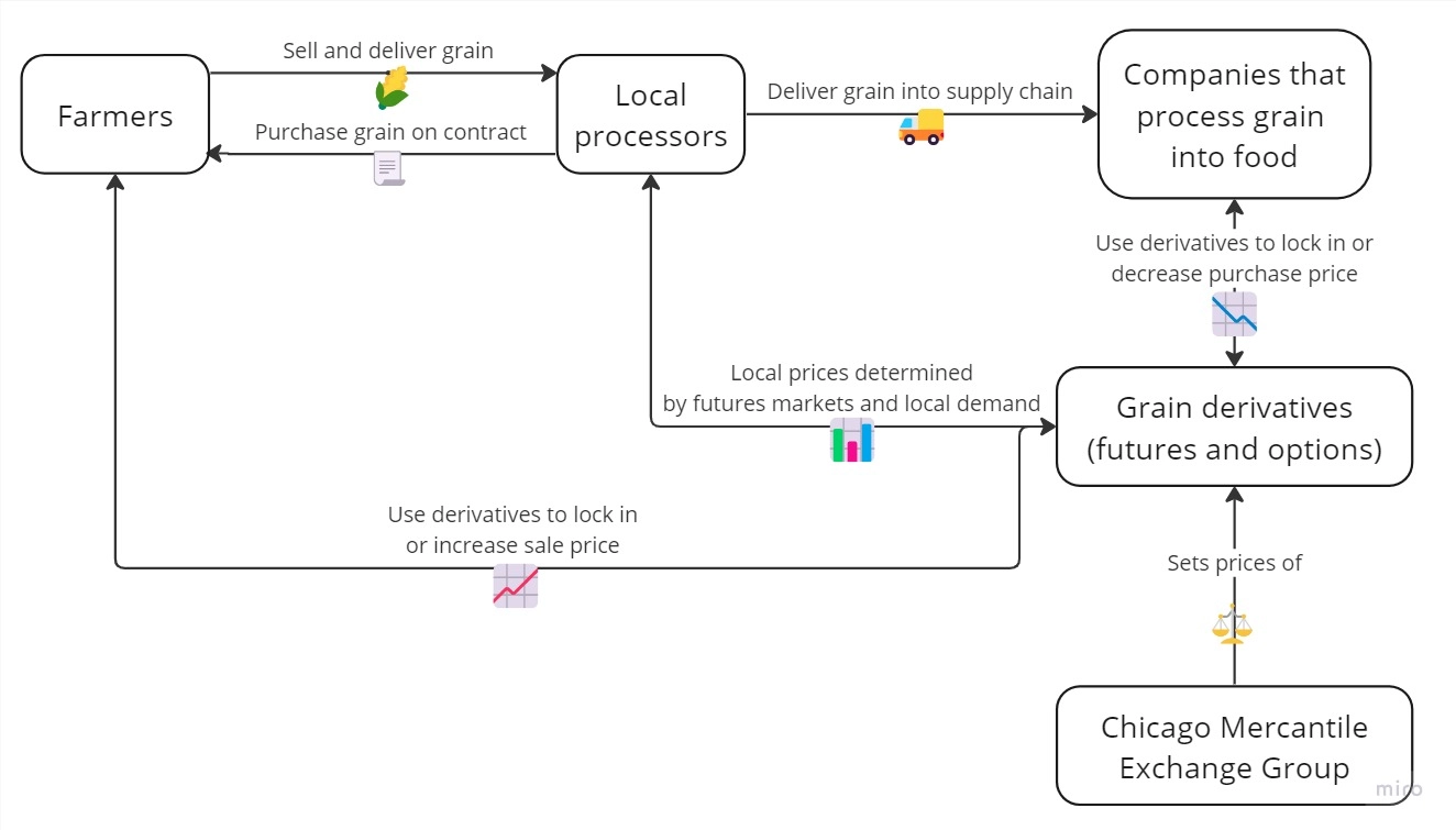

By understanding the scope of the marketplace, I was able to think critically about how local processors and derivatives brokers may be able to find use in the application by interacting with farmers.
Trading and hedging strategies
The variety of trading and hedging strategies farmers can utilize is a large topic unto itself. I focused on forward contracts and futures contracts, the most popular options for hedging.
- Forward contracts allow farmers to sell grain to local processors ahead of harvest when market prices are high
- Benefit: Price is completely locked in for the season with a local processor
- Risk: If farmer sells too much, crop failure will cause contract to be unfulfilled
- Farmers can place hedges by buying and selling futures contracts, which are based on the anticipated value of commodities
- Benefit: Selling price is guaranteed, with more flexibility than forward contracts
- Risk: If prices change and there’s a margin call, you need a significant amount of cash or credit on hand
Farmers
I identified the essential tasks in their market workflows:
- Quickly and frequently accessing up-to-date information on the markets
- Tracking information on contracts they’ve signed
- Checking on the details of their sales contracts
- Assessing trading strategies and simulating how different price scenarios may play out
I learned that as a user base, farmers are:
- Weary of technology
- Doubtful of their technical capabilities
- Expecting to see market data in the standardized format
From my research, I learned that simply replicating farmers’ existing workflows into technology was not going to be enough. Farmers would not deal with the hassle of learning how to use a new application unless it provided significant value.
I used my research findings with an eye for what would give farmers the most opportunity to increase their profits.
Impact of research
Features that directly address workflow pain points
As I describe in my product design case study, I used my knowledge to prioritize the features that would bring most value to grain farmers.
Shaping my design process
Personas
Personas have gotten a reputation as a weak design artifact, primarily because they're often more based in assumptions than research. I felt comfortable using personas because I had solid data on the kinds of behavior my target group engages in.
To that end, I emphasized the market strategies that the personas engaged in, emphasizing how they might interact with the application over personal characteristics.
Because the personas were based on reputable sources, I was more comfortable making them a central part of the design process. To that end, I wrote jobs-to-be-done style user stories for each persona that directly translated into user flows.
Creating a simple interface for a complex product
My research allowed me to identify important constraints for the product, primarily around keeping the interface to a low level of complexity for the farmer user base. One example of this was being as explicit as possible while using progressive disclosure.
In a data-heavy interface, progressive disclosure is necessary to create hierarchy and reduce the amount of visual noise. However, in my observations, I noticed that users were more likely to understand text instructions than common navigational elements that would facilitate progressive disclosure.
For example, I used Carbon Design System to build out the interface, and I made heavy use of data tables. According to the design system guidelines, an overflow menu is the suggested UI element to list actions to take on a data table item.
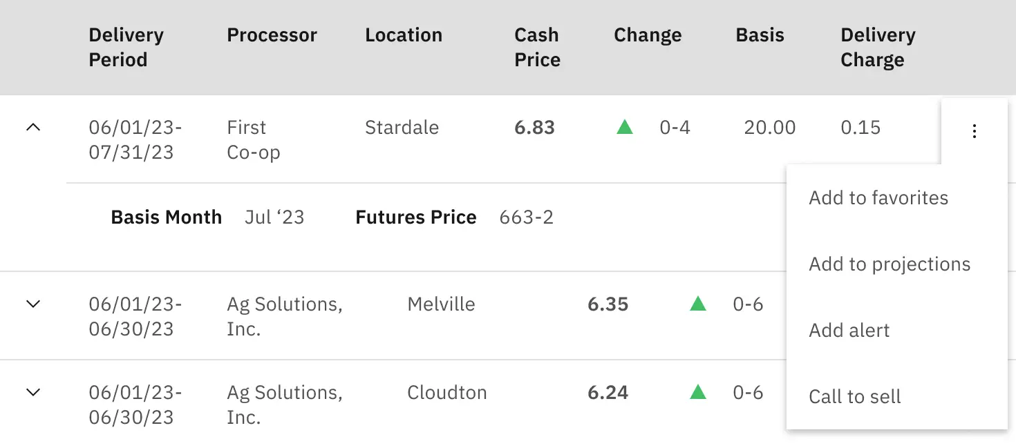

However, I was concerned that farmers would not find the overflow menu. To that end, the actions for each data table item are listed as labelled icon buttons.


The buttons take up more room, so it’s a slightly less elegant solution. However, in this case the increased visibility of the actions was more important.
Getting the details right
Contracts
Grain contracts are detailed documents. There are many specs associated with a contract, including storage rates, moisture requirements, and delivery charges.
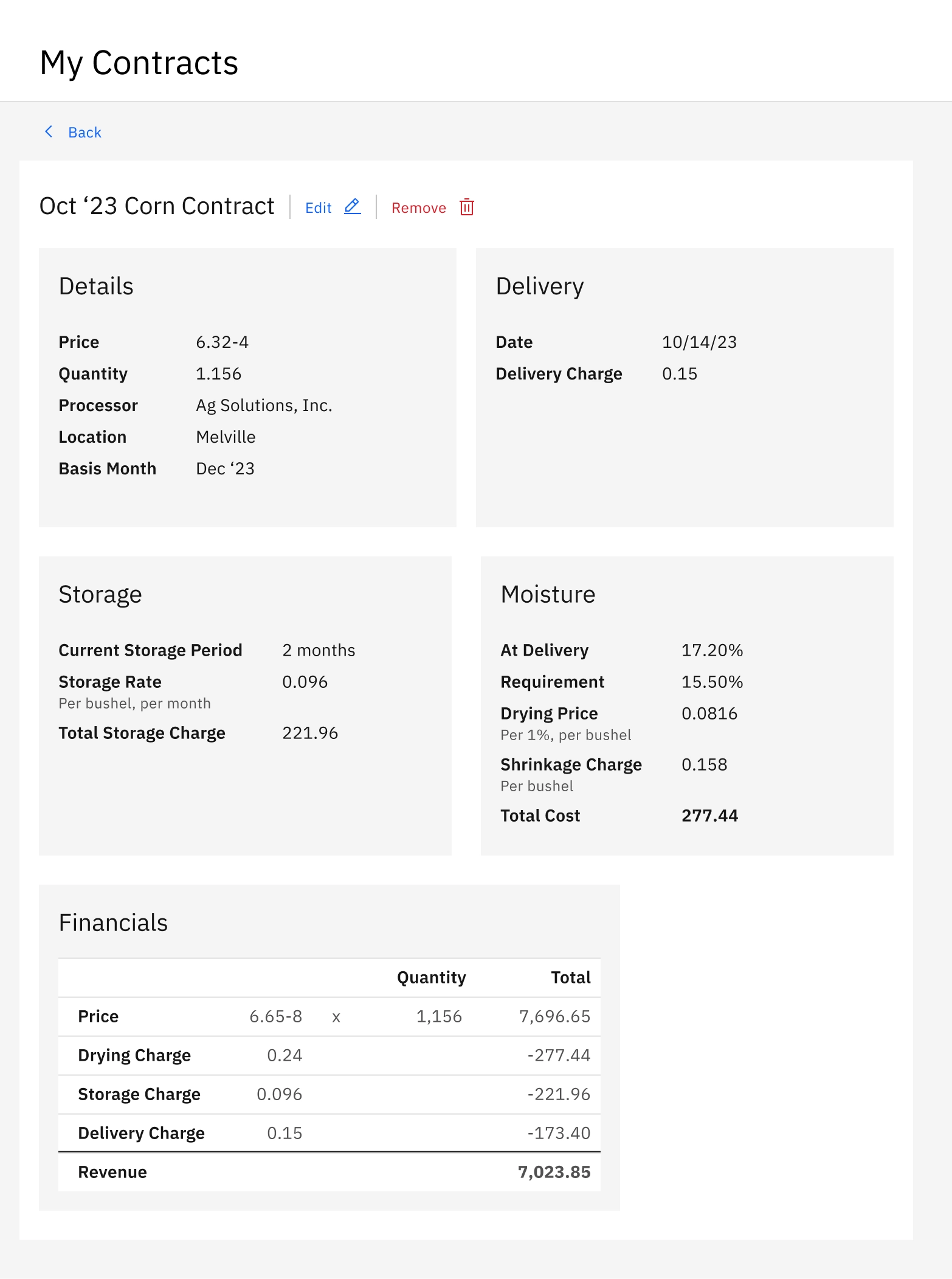

My research allowed me to dig into the small contract details that increase the relevancy of the product. After all, I couldn’t expect saved contracts to have meaning if they were missing important charges.
Revenue statistics
Another key feature of the application is an overview of seasonal revenue statistics. Without research, I wouldn’t have understood which statistics held the most importance to farmers.
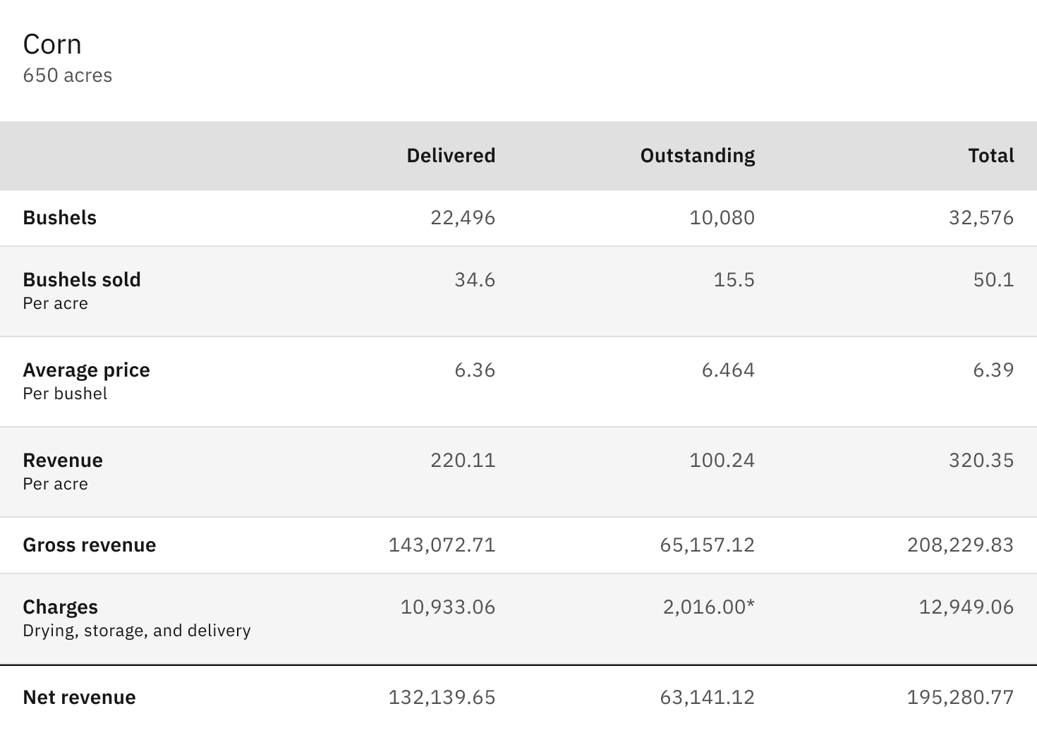

For example, in the contract summary above, Bushels sold (per acre), Average price (per bushel), and Revenue (per acre) all have significant meaning to farmers. I may not have included any of them without learning more about the topic.
Linking together features to facilitate market strategies
Finally, I crafted workflows that integrated my knowledge of market strategies. For example, one strategy when selling futures contracts is to buy them back later in the season, ideally at a lower price to incur a profit.
Because I was aware of that strategy, I knew that farmers would want to closely follow changes in that contract price, particularly if prices fall. In the Add a futures contract workflow, I inserted a screen to add a market alert for the same month. The Price Threshold alert send a notification to the farmer when prices go fifty cents above or below the entered contract price of 6.53.
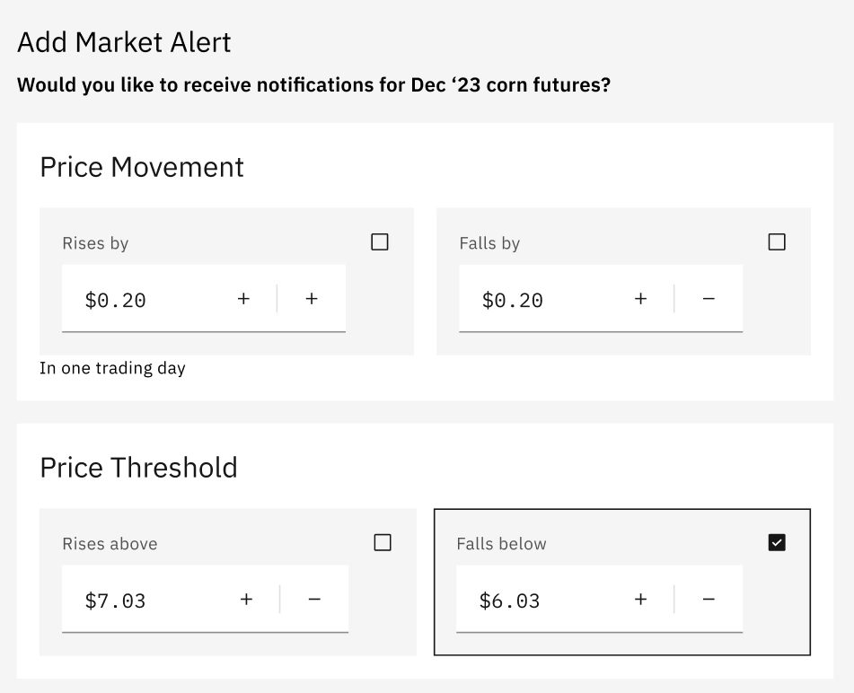

This screen encourages farmers to sign up for a market alert. With knowledge of that strategy, the market alert request is timely and appropriate. If accepted by the user, an important feature to encourage further use of the product will be activated.
Conclusion
The process illustrated here exemplifies my approach to research and design: extending the value proposition by substantively understanding a problem area and integrating that knowledge into my designs. In this case, I needed to have a thorough understanding of the user and business perspectives to simplify farmers’ workflows.
The more work it is for a user to successfully integrate a product into their business, the higher the potential reward from using said product has to be.
With the specific use case and target user, even though the potential for additional profits was high, it was important to take every opportunity to reduce the effort for farmers to get started and see the value in the product.
Attributions
- Photo by Svitlana Rusak on Unsplash
- Photo by Jim Witkowski on Unsplash